
A logo developed for a nonprofit foundation supporting Roswell Park Cancer Center. Edith Peskir created the foundation to honor her partner, Marietta, and needed an identity that reflected her personality while remaining clear and appropriate for a donor facing organization.
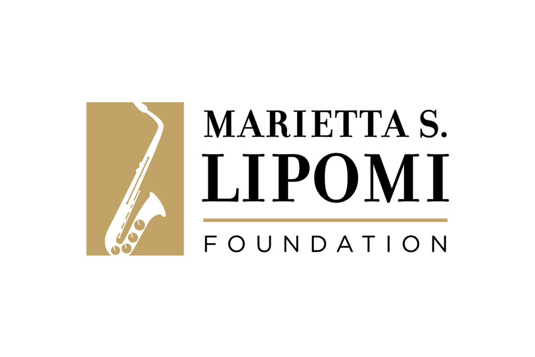
Edith wanted a logo that celebrated who Marietta was without becoming overly sentimental. Marietta loved playing the saxophone despite being “terrible” at it, a detail that captured both her self awareness and her ability to find joy in it anyway.
That idea became the foundation of the identity. The challenge was translating that personality into a mark that felt meaningful and distinctive, while still functioning as a professional, enduring nonprofit identity.
I began by studying saxophone forms to understand which elements made the instrument immediately recognizable. Early iterations included more detailed features, but these quickly became visually dense. Through refinement, I reduced the form to a controlled silhouette while retaining select details, allowing the icon to feel recognizable and expressive without becoming cluttered. This established a balance between personality and clarity.





The identity needed to carry a personal story without losing clarity or professionalism. At the same time, the length of the name introduced structural challenges within the layout.
By referencing how other long name organizations handle hierarchy and stacking, I tested multiple configurations before settling on a system that balanced proportion and readability. This allowed the typography to support the icon without competing with it.
By controlling the level of detail in the icon and carefully structuring the typography, I was able to balance expression with usability, resulting in a mark that feels both personal and appropriate.

The final logo features a contained saxophone icon paired with structured typography, translating a personal tribute into a clear, recognizable identity. The balance of detail and simplicity allows the mark to feel expressive while remaining scalable and professional.
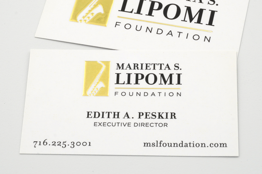
The identity was extended into physical materials, including raised foil business cards and coordinating stationery, reinforcing the mark across both visual and tactile applications.
The result is a cohesive identity system that provides a clear, consistent presence across donor materials and communications, supporting the foundation’s mission while honoring Marietta’s legacy in a meaningful, lasting way.
Client: Marietta S. Lipomi Foundation
Role: Identity Design
Date: May 2023