First Line Brewing needed a menu system that reflected its relaxed, community-focused atmosphere while supporting frequent updates to its drink offerings. The solution balanced a simple, patriotic visual style with a flexible format that could accommodate constant change while remaining cost-effective to produce.
Vision
Simple, Patriotic, Community-Focused
The goal was to create menus that reflected First Line’s welcoming, no-frills environment and its emphasis on honoring veterans and first responders. The design needed to balance personality with practicality, staying aligned with the brewery’s casual, patriotic identity while accommodating regularly changing content.
Process
Separating Stability from Change
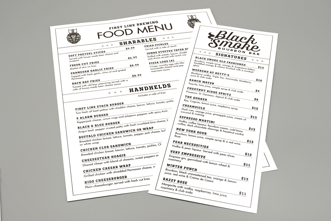
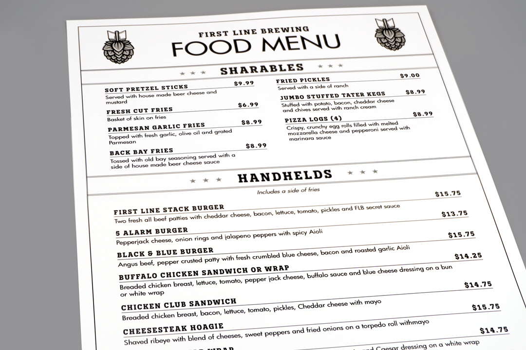
The project was split into two distinct pieces: a food menu that remained largely consistent and a drink menu that required frequent updates due to a regularly rotating selection.
Existing brand materials used a mix of typefaces, so a typography evaluation was conducted to determine which combinations worked best together. Novecento Slab and Futura were selected to create a consistent typographic foundation aligned with the brewery’s tone.
The layout was structured with clear hierarchy, spacing, and typographic rules so content could be updated without requiring full redesigns, establishing a flexible system designed to accommodate constant change. These rules ensured the food and drink menus remained visually aligned as a cohesive set, despite differing update needs.
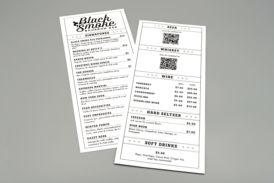
To reduce the need for reprints, QR codes were incorporated into the layout to link to a live, externally managed list of offerings and prices. When printed updates were unavoidable, the menu’s compact size and black-and-white format kept reprints fast and cost-effective.
Because the layout needed to remain clean and easy to update, symbolic elements were used sparingly. The existing “Hop Bomb” graphic maintained brand continuity, while star motifs were introduced to reinforce the brewery’s patriotic tone without adding visual clutter.
Key Decisions
Designed for Flexibility & Clarity
- Designed the drink menu as a compact, half-sized layout to support quick, low-cost reprints as offerings changed.
- Integrated QR codes into the layout to support real-time updates while maintaining clarity and usability.
- Applied a consistent black-and-white palette to unify the menu system across formats.
- Incorporated star motifs to reflect the brewery’s “Pay It Forward” initiative and reinforce its patriotic tone.
- Integrated the existing “Hop Bomb” graphic to maintain brand continuity.
Challenges
Managing Constant Change
The drink menu required frequent updates, while still needing to maintain the brewery’s casual, patriotic tone and remain visually aligned with the more stable food menu. This created a risk of increased production costs and visual drift between the two menus over time.
Because offerings changed frequently, relying on traditional print updates alone would have been inefficient and difficult to maintain over time. This was addressed by incorporating QR-based updates into the layout while ensuring printed content remained fast, cost-effective, and visually consistent through a simplified format.
Outcome
Flexible, Cohesive & On-Brand
The final menu system provides a clear, easy-to-navigate experience that reflects First Line Brewing’s casual, patriotic identity across both food and drink menus as a cohesive, consistently structured system.
By combining a structured print format with QR-based updates, the system supports frequent changes without sacrificing consistency, allowing the brewery to update offerings as needed while maintaining a unified and reliable presentation.
“We love this and are going to go with them.”
Michael A. Maiorana, Co-Founder
Client: First Line Brewing
Role: Information Design | Layout Design | Production Design
Date: March 2023