Multi-year development of an in-house stationery product line.
Buffalo Design & Printing developed an in-house stationery line intended for wholesale buyers. Over time, the line expanded across formats, materials, and channels, requiring consistent production standards, scalable organization, and a cohesive visual direction that brought previously separate product styles into a unified line.
Vision
Sell the Line, Showcase the Work
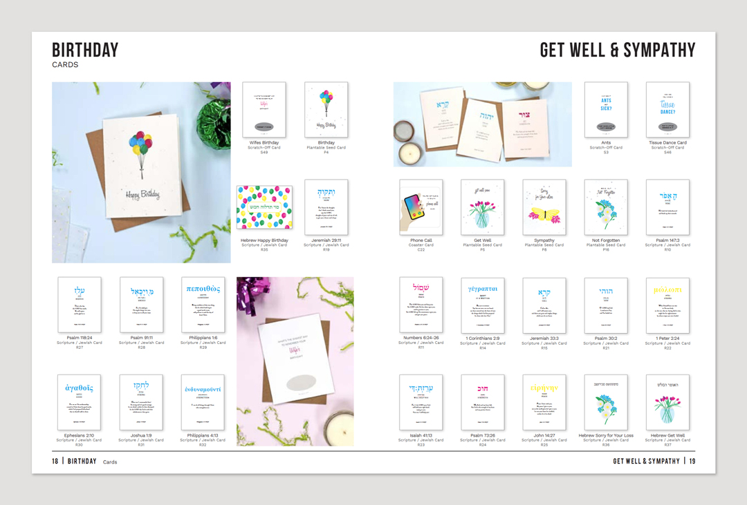
The stationery line was released for wholesale buyers, supported by a catalog that presented the products for sale. The catalog also served as a demonstration of Buffalo Design & Printing’s manufacturing capabilities for stationery brands.
This project spanned multiple years, product expansions, and a major rebrand, with responsibilities evolving alongside the growth of the line.
Role & Scope
Direction to Production
Product direction and creative concept for the line were established by company ownership. The visual system and product designs translated the concept into finished products that could be manufactured, cataloged, and sold.
Over time, the scope expanded beyond individual product designs to include the organization and presentation of the entire line, supporting its growth across catalogs, trade shows, and online sales channels.
Across the full timeline, responsibilities included:
- Production-ready file setup
- Visual design across multiple product categories
- Translating legacy designs into updated brand systems
- Managing and extending the SKU structure
- Catalog layout and structural organization
- Product photography direction and execution
- Trade show booth graphics, signage, and supporting marketing materials
- Online product listings and MIS-integrated web-to-print ordering
The scope increased over time, with later phases involving greater responsibility for maintaining consistency across the growing product line.
Process
The Stationery Line as a System
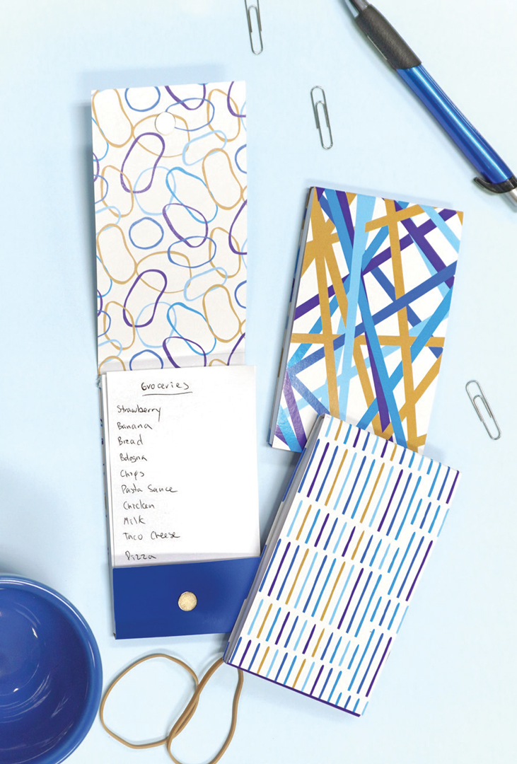
What began as a small set of products grew into a broad stationery line spanning multiple formats including:
- Scratch-off cards
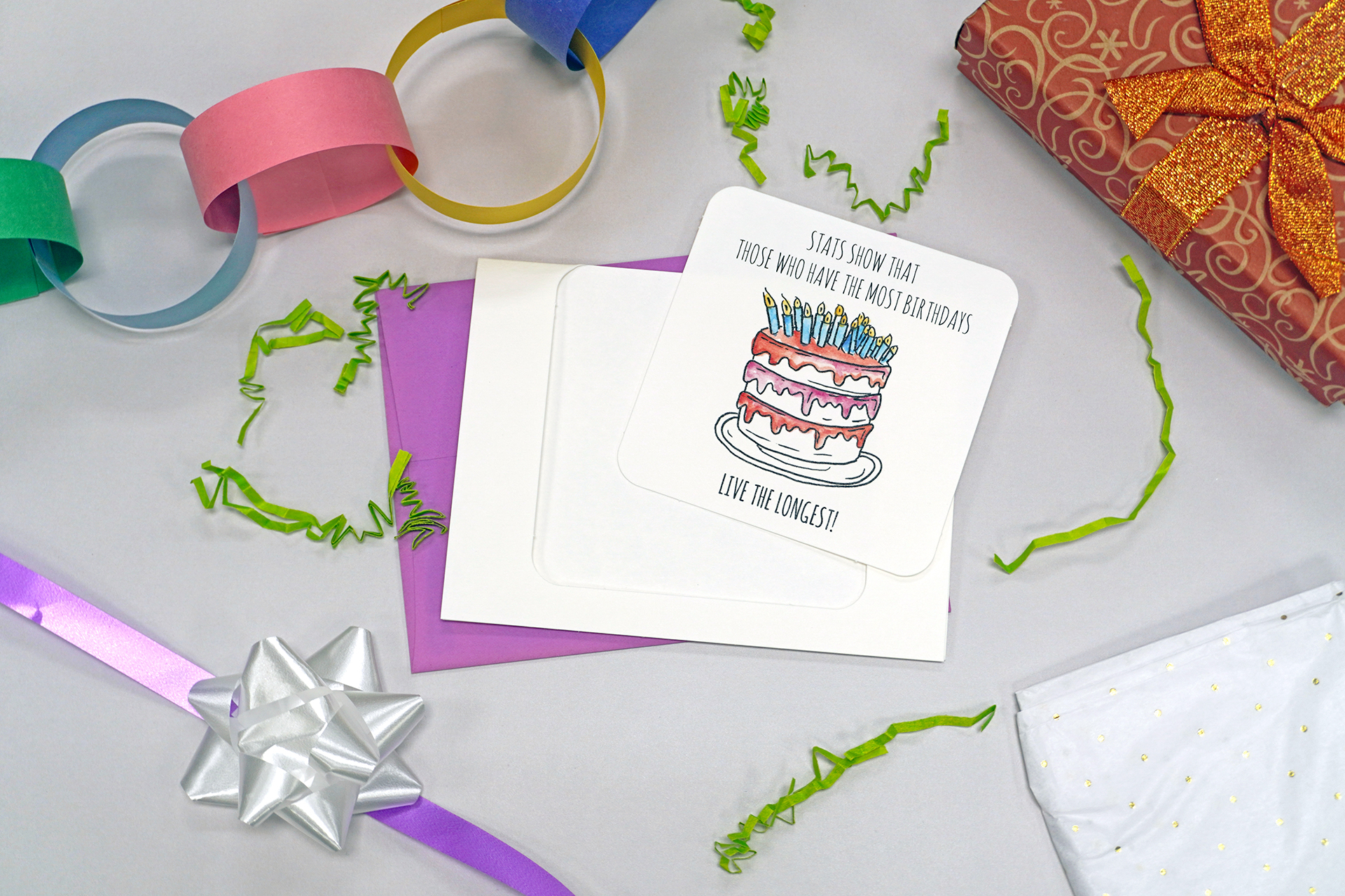
- Pop-out coaster cards
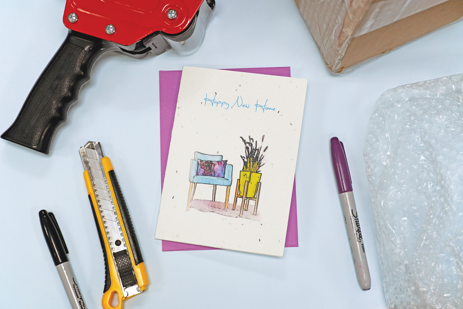
- Seed paper and other specialty stock cards
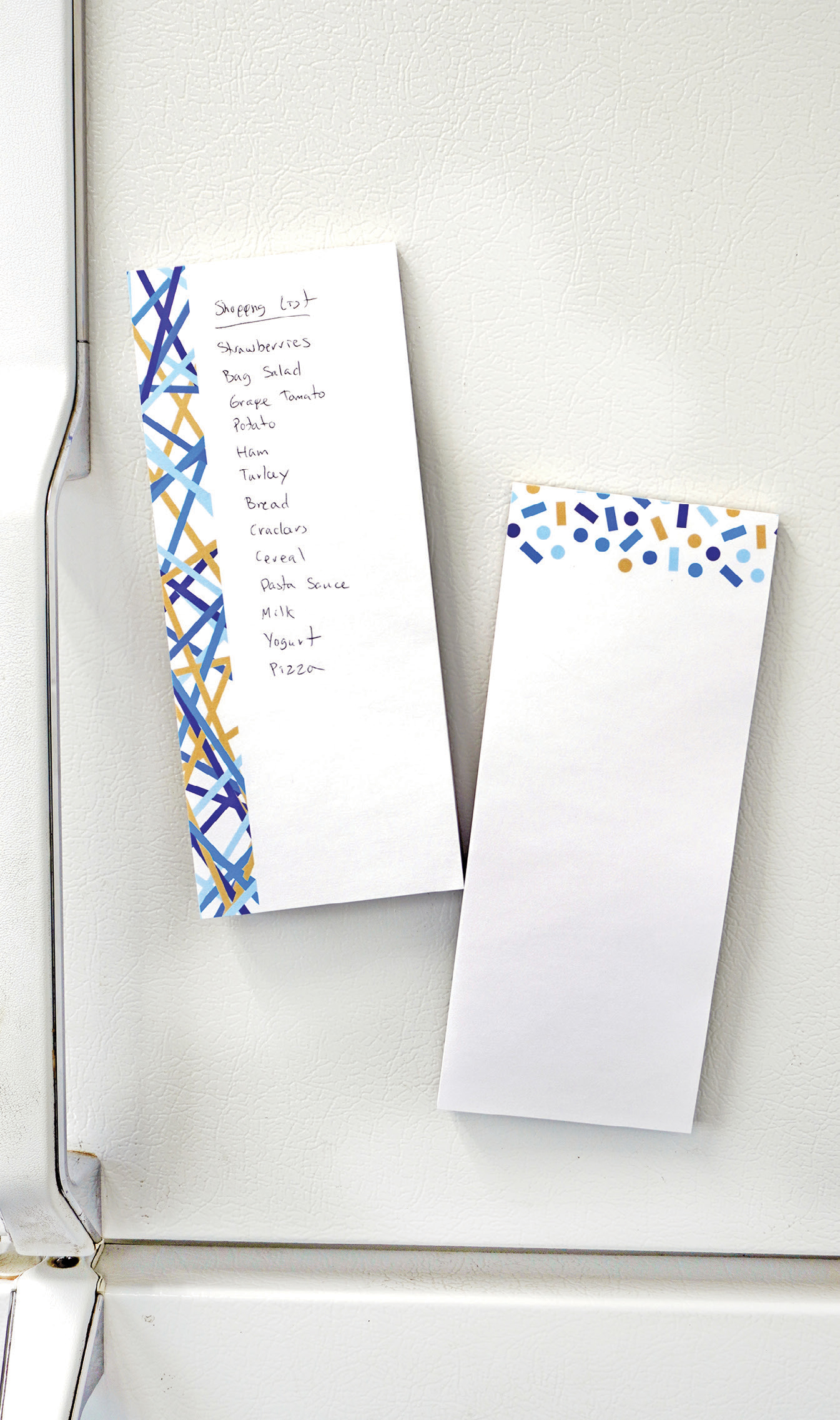
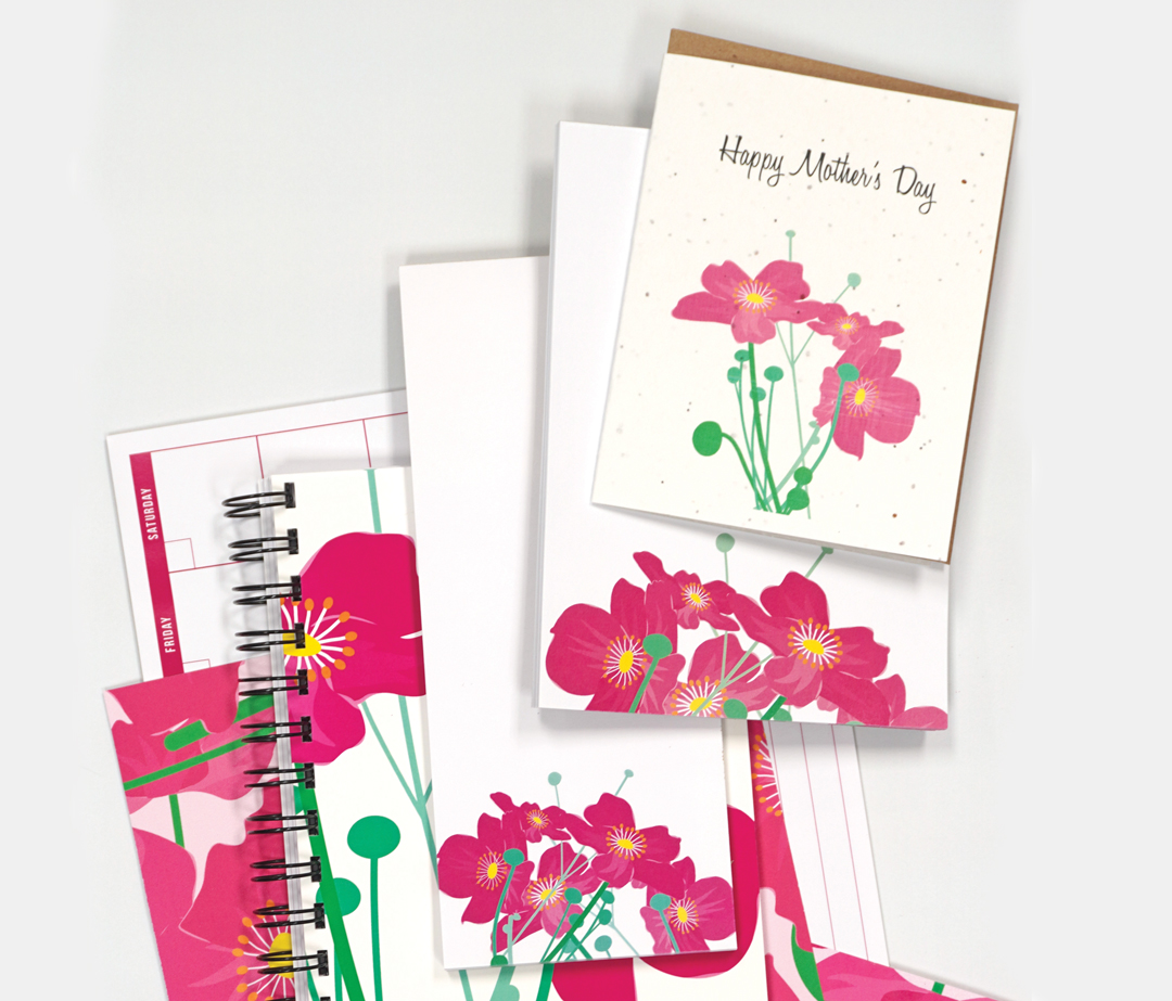
- Notecards
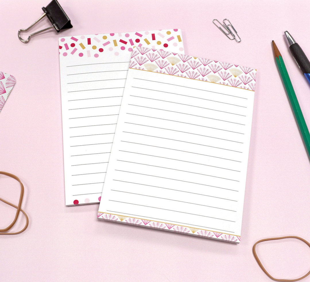
- Various notepad formats
- Wall decal sets
- Wrapping paper rolls
- Calendars
- Height charts
- Journals
- Magnets
- Mousepads
- Paper airplane cards
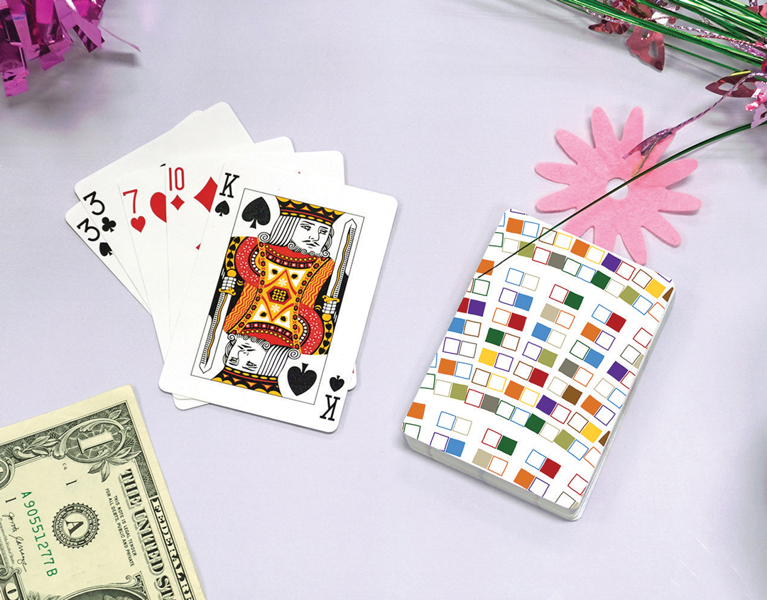
- Playing cards
- Luggage tags
As the line expanded, the challenge was not just adding new products, but maintaining a structure that could support the growing line without fragmenting it. Early organizational systems—including SKU logic, file naming conventions, and production-ready file setup—were established and extended as the product mix grew, allowing new products to be introduced without disrupting existing workflows.
Creating a Cohesive Identity
Over time, it became clear that the stationery line lacked a cohesive presence in wholesale and trade show settings. Each product type maintained its own visual style and internal consistency, but those styles differed significantly from one another. When displayed together, the line lacked a clear visual identity.
To better align the products with Buffalo Design & Printing’s identity as a printer and manufacturer, the stationery line was rebranded to create a more cohesive visual identity across the full product range. The design work during the rebrand focused on:
- Establishing a clearer visual language rooted in print-inspired elements
- Defining a consistent color palette and typography framework
- Migrating existing products into the updated visual system without discarding successful designs
- Refining the catalog structure to support both growth and clarity
Rather than redesigning everything, many existing products were translated into the updated brand system—preserving continuity while improving cohesion across the line.
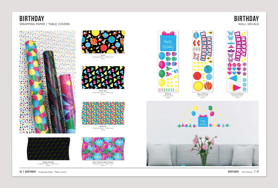
A Catalog Built to Evolve
As the stationery line matured, the catalog evolved from a simple product listing into a structured wholesale tool. Early versions grouped products by type, but later iterations reorganized the catalog by occasion and use case—reflecting how buyers shop rather than how products are manufactured.
The catalog’s grid-based layout maintained consistency across pages while allowing new products to be added as the line expanded. During the rebrand, the layout and typographic hierarchy were refined to improve clarity and create a more cohesive presentation. Product photography was also introduced during this phase, establishing a visual standard for how the products were presented and strengthening the catalog’s overall presentation. Together, these structural decisions allowed the catalog to evolve across multiple editions without requiring a full redesign.
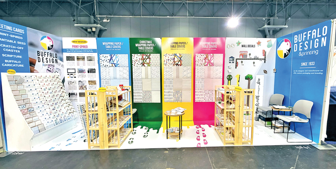
Trade Shows & Channels
Beyond the catalog and products themselves, the stationery line was presented through trade shows and online sales channels. At shows, physical product samples, booth graphics, and catalogs worked together to introduce the line to wholesale buyers while also demonstrating Buffalo Design & Printing’s manufacturing capabilities to stationery brands.
Design work supported these efforts through materials used to display and sell the product line, including:
- Booth wall graphics and large-format displays
- Show signage and supporting collateral
- Line cards and pricing sheets for stationery brands evaluating BD&P as a manufacturing partner
Online channels were also expanded over time, with product listings maintained across multiple platforms as the line grew. A centralized product tracking system maintained SKU information, product descriptions, and catalog placement, ensuring consistent product data and naming across channels. This structure supported the introduction of new items and the removal of discontinued designs while keeping the stationery line organized as it continued to expand.
Challenges
Maintaining Cohesion Through Expansion
Early versions of the stationery line and catalog were already in place before the rebrand. When the visual system was updated, existing designs needed to be translated into the new brand while maintaining continuity across the product line.
After the rebrand, the stationery line expanded with the introduction of additional product types. New designs needed to fit within the updated visual system while remaining visually consistent alongside earlier products as the line continued to grow.
Direction was typically provided broadly, with work progressing independently, and periodical feedback from company ownership shaping revisions. The primary challenge throughout the project was maintaining cohesion across an expanding product line while the catalog, designs, and product mix continued to evolve.
Outcome
A Scalable Product Line
By later editions, the stationery line functioned as a cohesive, scalable product line rather than a collection of individual designs. The rebrand and catalog refinements strengthened the cohesion and presentation of the product line across the wholesale catalog, trade show displays, and internal product organization systems.
Over multiple years, the stationery line expanded from a small group of products into a structured offering spanning numerous formats and categories. Developed within a manufacturing environment, the work balanced visual design decisions with production realities and organizational systems to support the continued growth of the product line.