
Layla created My Type, her own line of natural hair care products, after struggling to find store-bought options that gave her the results she wanted. She began mixing products at home, and as interest in them grew, she needed a logo to give the emerging brand its own identity. The project began with the logo and later expanded to include product labels and a business card. The identity needed to reflect Layla’s personality and celebrate natural hair, while being flexible enough to carry across a growing range of products.
Client’s Vision
Afro-Centric Funk
Layla came to the project with a clear starting point: a woman’s head as the central visual, with My Type incorporated around it. She wanted the hairstyle to represent one typically worn by African American women and envisioned an identity that felt funky, feminine, and retro.
Her initial sketch also established an important part of the composition, with the brand name following the shape of the head rather than sitting separately from the illustration. The goal was to preserve that personality while shaping her idea into a logo that could carry across the growing product line.
Process
Finding the Right Hair
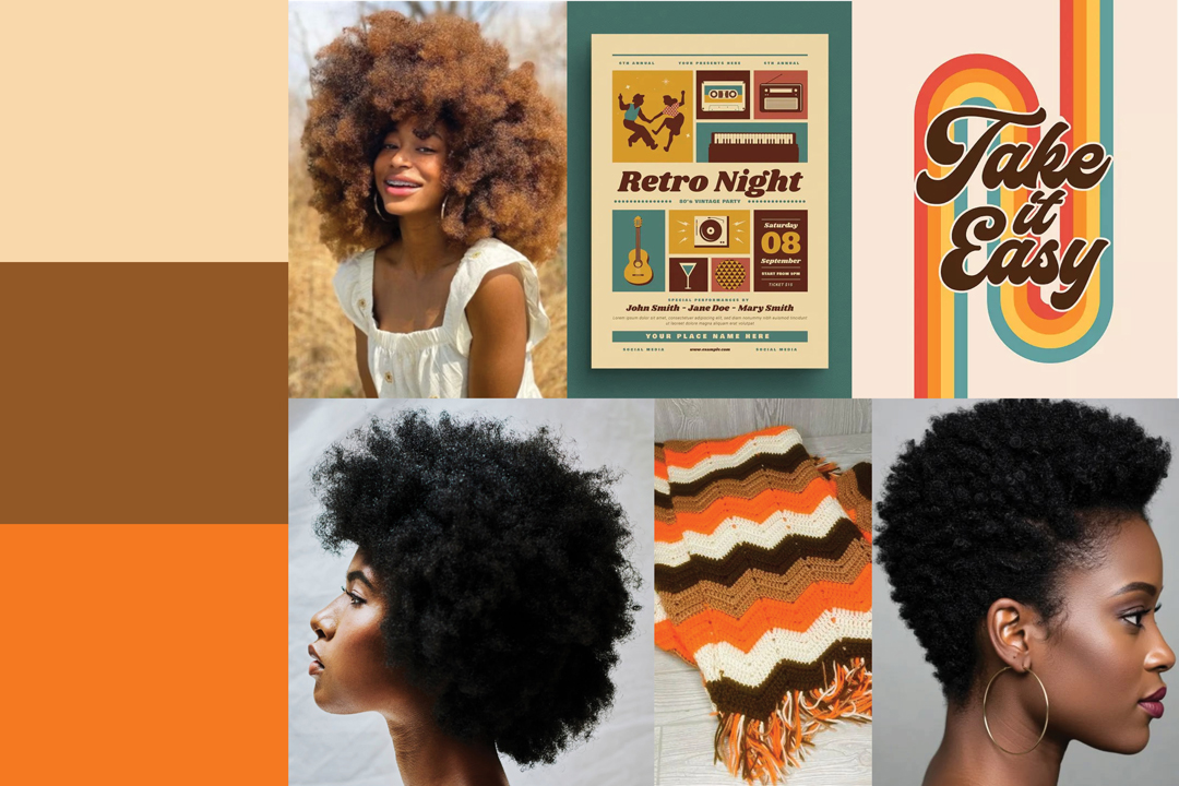
I began by gathering references of natural hairstyles and hair textures, primarily focusing on African American women. Because the hair would form the dominant shape of the logo, finding the right silhouette was important to establishing both the character and recognizability of the identity.
I also explored retro color palettes and funky visual references to determine how the illustration, typography, and color could work together. Rather than relying on the hairstyle alone to communicate the concept, these elements helped establish the playful retro direction Layla wanted.
Building the Funk
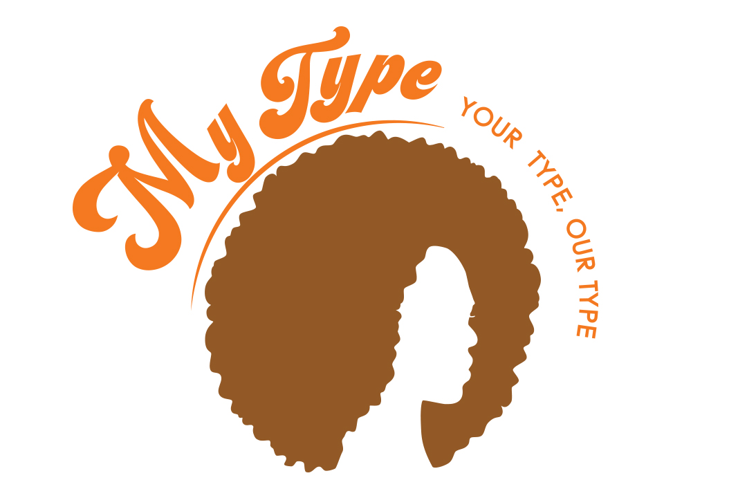
The logo developed around a profile silhouette with textured natural hair as its central visual. Exaggerated eyelashes and lips added a feminine quality, while flowing, hair-inspired linework introduced additional movement and texture.
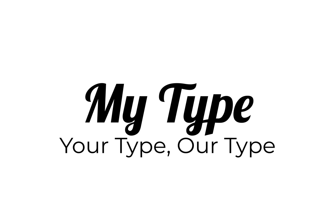
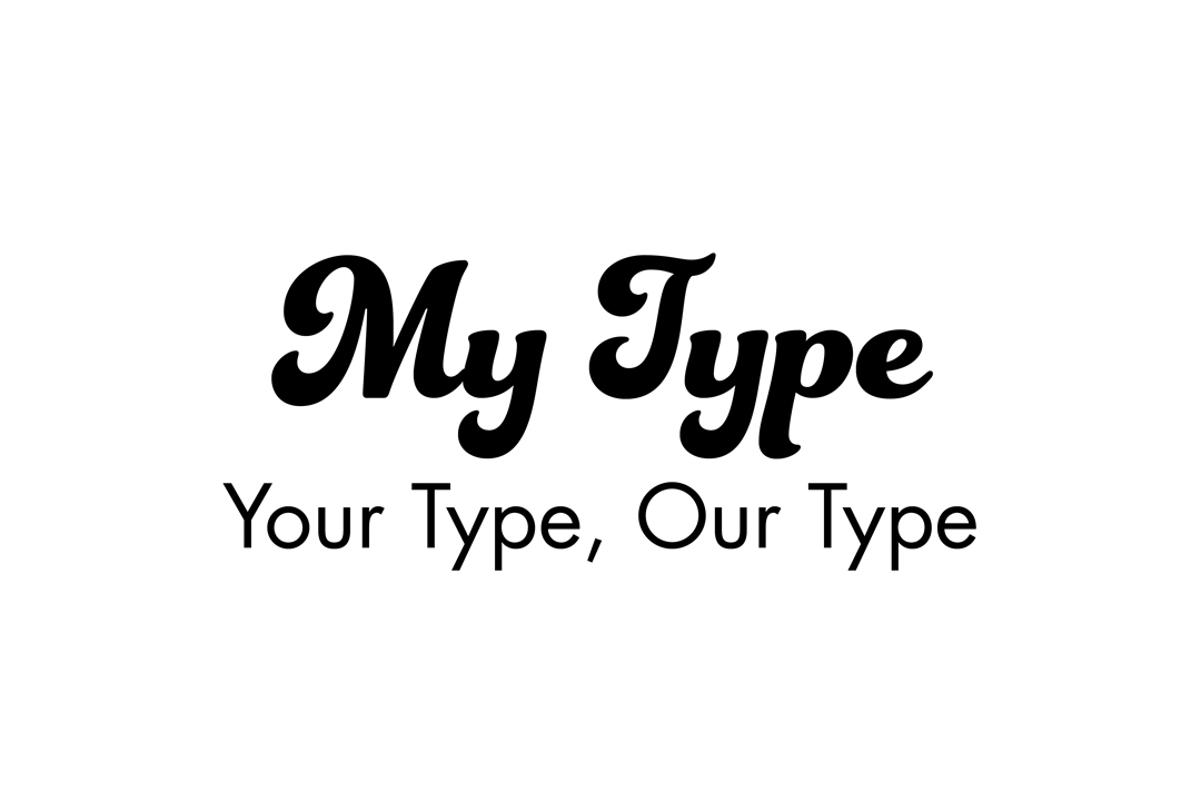
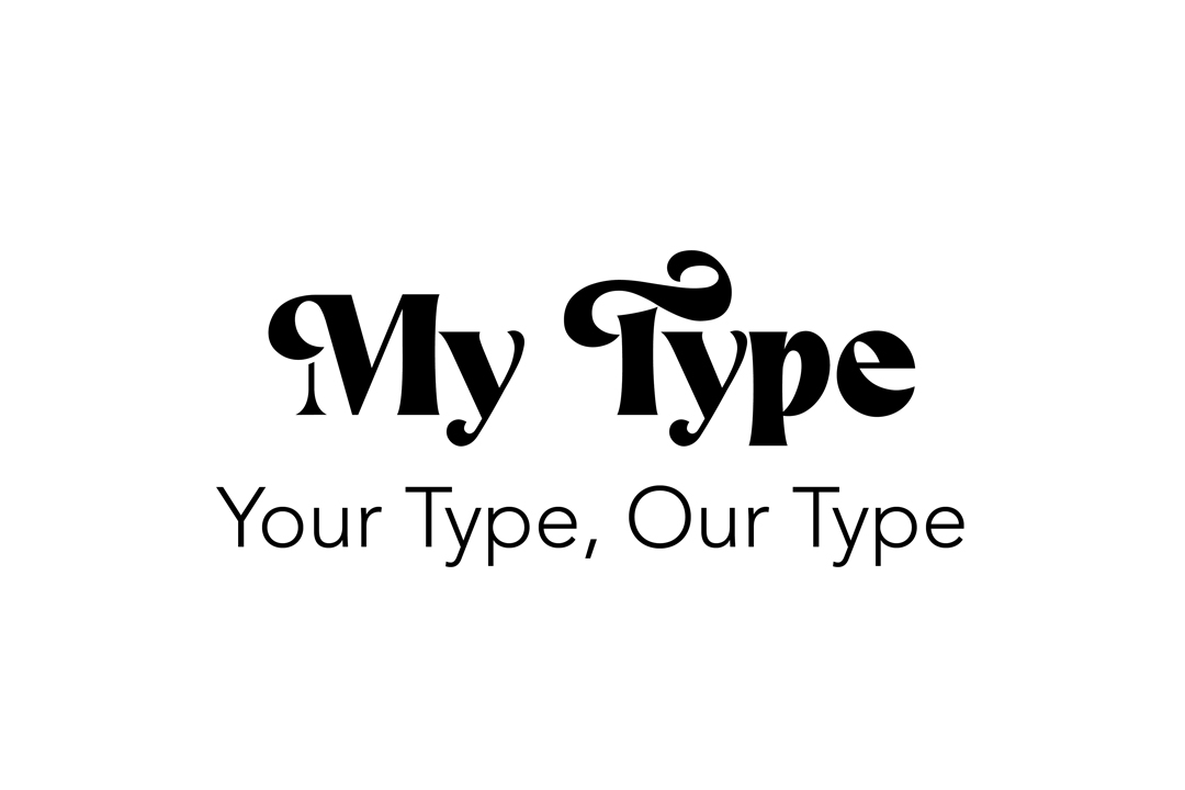
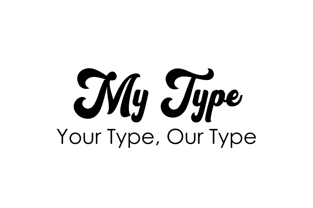
Typography paired the expressive, retro character of Vintage Party with the cleaner Century Gothic. This created a contrast between the personality of the brand and the more functional typography needed as the identity expanded into product packaging. A limited palette of warm, retro-inspired colors helped tie the different elements together and provided a consistent foundation for future applications.
Making Room for My Type
Layla initially envisioned the My Type name sitting lower around the neck of the silhouette. As I experimented with the composition, that placement made the name less prominent and more difficult to read. Moving it upward allowed the typography to remain integrated with the illustration while giving the brand name greater visual emphasis.
I tested different typefaces, sizes, and placements to find a balance between Layla’s original idea and the practical needs of the logo. A smaller secondary treatment for Natural Hair Products completed the hierarchy without competing with the My Type name.
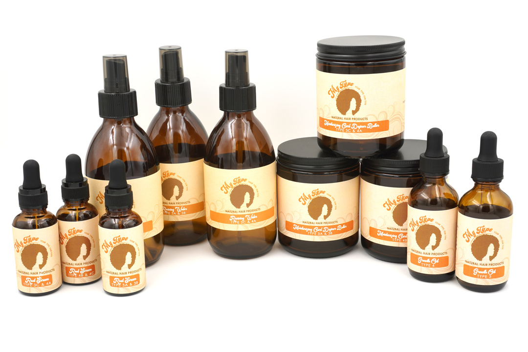
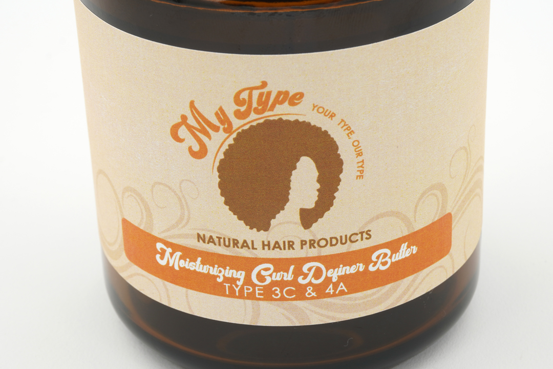
Once the logo was established, I carried the identity into a series of product labels. Each label needed to accommodate changing product names and hair types along with ingredients and usage instructions. I developed a consistent structure that kept the logo prominent while separating the functional information into clear areas. The flowing hair-inspired linework was extended across the labels as a secondary graphic, adding movement and texture without competing with the product information.
Challenges
Funky Wishes, Functional Needs
The main challenge was translating Layla’s specific vision into an identity that could function beyond the original concept. The curved typography and illustrated silhouette gave the logo its personality, but they also created questions of readability, hierarchy, and how the identity would adapt when applied to packaging.
Experimenting with the placement and scale of the typography helped preserve the character of Layla’s idea while improving recognition of the My Type name. That same balance continued into the labels, where the expressive identity had to coexist with practical information such as ingredients, instructions, product names, and hair types.
Outcome
A Bold, Natural Statement
The finished identity gave My Type a distinctive visual language built around natural hair, expressive typography, warm retro color, and flowing graphic elements. What began as a logo developed into a cohesive system that could extend across Layla’s growing product line and supporting printed materials.
Across the labels, the identity remains prominent while a consistent hierarchy organizes the information specific to each product, allowing products such as Growth Oil, Reviving Water, Root Serum, and Moisturizing Curl Definer Butter to feel like part of the same family. Layla was thrilled with the result: “I am so pleased with these… I love them!”
“I am so pleased with these… I loved them.”
Layla Robinson, CEO
Client: My Type
Role: Brand Development | Packaging Design
Date: September 2022