Tennyson Court is an assisted living and memory care facility in the Buffalo, NY area focused on compassionate care, independence, and community. The project began as a brochure redesign intended to support two audiences navigating the transition differently, prospective residents facing a major life change and the adult children often responsible for final care decisions. As the project developed, the scope expanded into a broader collateral system designed to make information feel approachable, navigable, and emotionally reassuring across multiple touchpoints.

Vision
Trust Through Transition
The materials needed to feel welcoming and reassuring without losing clarity or professionalism. Families needed confidence in the facility’s level of care, while prospective residents needed to feel comfortable, respected, and emotionally included in the transition.
Tennyson Court already had recognizable brand elements in place, including typography, color, and logo usage, but the supporting materials lacked consistency across print touchpoints. The goal became creating a more unified system that balanced emotional warmth with structured, easy to navigate communication.
Process
Designing for Different Perspectives
The project centered around two audiences moving through the same transition from very different emotional perspectives. Adult children often approached the materials looking for clarity, reassurance, and confidence in the level of care being provided, while prospective residents needed to feel welcomed, respected, and emotionally comfortable with the transition itself.
This established emotional tone, readability, and navigational clarity as primary design constraints rather than purely stylistic decisions. Layouts needed to feel guided and approachable rather than dense or overly promotional.
Structuring Information Clearly
The materials also needed to support practical orientation, including facility layouts and living arrangements. Information was intentionally segmented into smaller, structured sections to make the materials feel easier to navigate and less overwhelming during an emotionally complex decision making process. This reinforced clarity and ease of navigation as central parts of the design approach.


Establishing Visual Consistency
Existing brand elements were evaluated to determine what could be carried consistently across materials. Merriweather, already tied to the logo, was used for headings, while Raleway, already present on the website, was carried into body copy to maintain continuity between digital and print touchpoints. Segmented color bars, restrained palette choices, and framed photo layouts were also repeated throughout the system to reinforce visual consistency across materials.
Key Decisions
Balancing Warmth & Readability
- Typography was scaled slightly larger than standard marketing collateral to improve readability for older residents without making the materials feel clinical or oversized.
- Information was segmented into smaller, structured sections to make the materials feel easier to navigate and less overwhelming during a high stress decision making process.
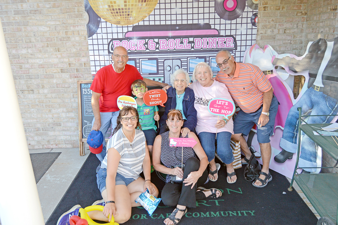
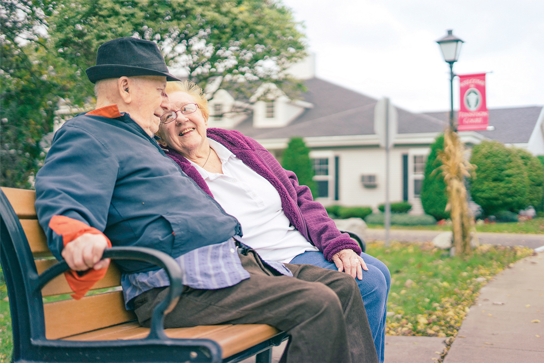
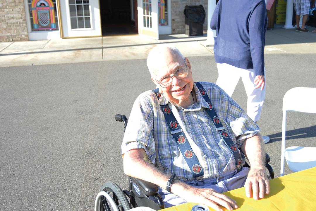
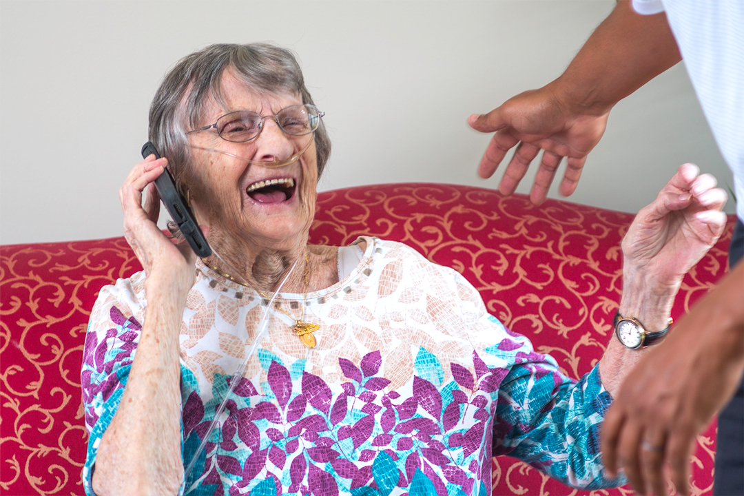
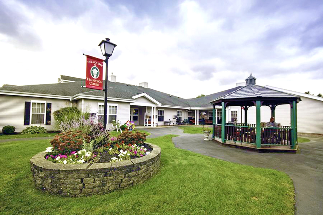
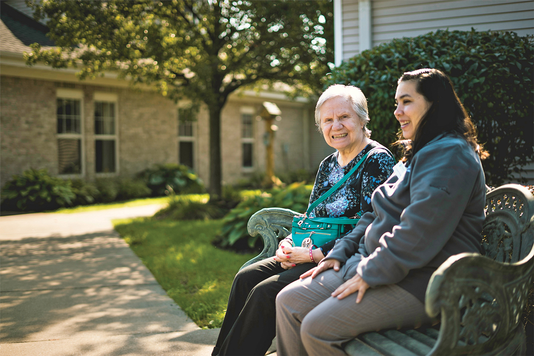
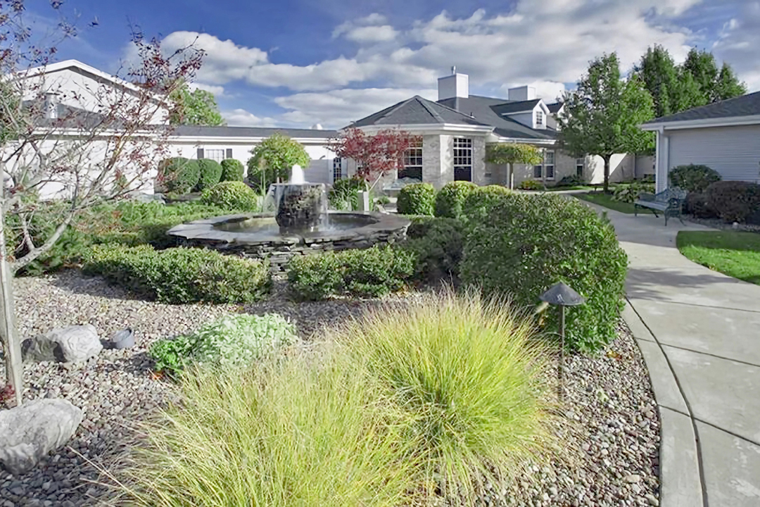
- Photography was used to interrupt denser informational sections and reinforce community, comfort, and daily life without relying on overly sentimental presentation.
- Soft greens and cream tones were carried throughout the system to create a calm, welcoming atmosphere aligned with the existing brand identity.
- Repeating structural elements, including segmented color bars and framed photo layouts, helped create familiarity and consistency across the broader collateral system.
Development
Extending the Visual System
As additional communication needs emerged, the project expanded beyond the original brochure into a broader collection of supporting materials, including maps, pricing sheets, stationery, notecards, and presentation pieces.
Consistent typography, segmented color bars, framed photo layouts, and restrained visual pacing were repeated throughout the system to create familiarity across materials while allowing each piece to remain functional for its specific purpose. This helped unify informational, navigational, and administrative materials into a more cohesive and approachable communication system.

Challenges
Balancing Clarity & Comfort
The materials needed to feel welcoming and emotionally reassuring without losing structure, clarity, or professionalism. Leaning too heavily into informational communication risked making the pieces feel cold or institutional, while pushing too far toward warmth could reduce credibility and navigability. The final direction relied on restrained visual pacing, structured layouts, accessible typography, and approachable imagery to balance both needs across the broader collateral system.
Outcome
Supporting Confidence Through Design
The final result was a cohesive collateral system that balanced emotional reassurance with structured, easy to navigate communication. Across brochures, maps, pricing materials, and stationery, the materials created a more welcoming and approachable experience while still supporting clarity and confidence during an important life transition.

Client: Tennyson Court Assisted Living & Memory Care
Role: Information Design | Collateral Design
Date: August 2021