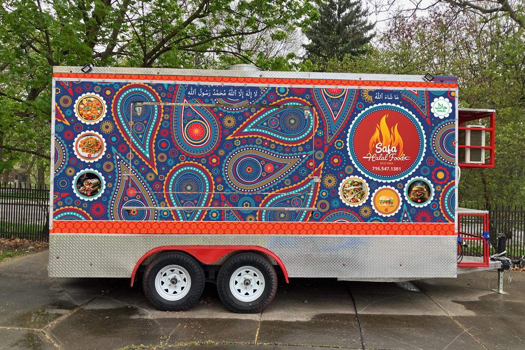
The Safa Halal Food Truck required transforming a plain trailer into a bold, eye-catching presence. The goal was to stand out in busy street settings and attract attention from a distance. The challenge was creating a high-density, “busy” design that still maintained clear focal points and visual control.
Vision
“Crazy, Busy”
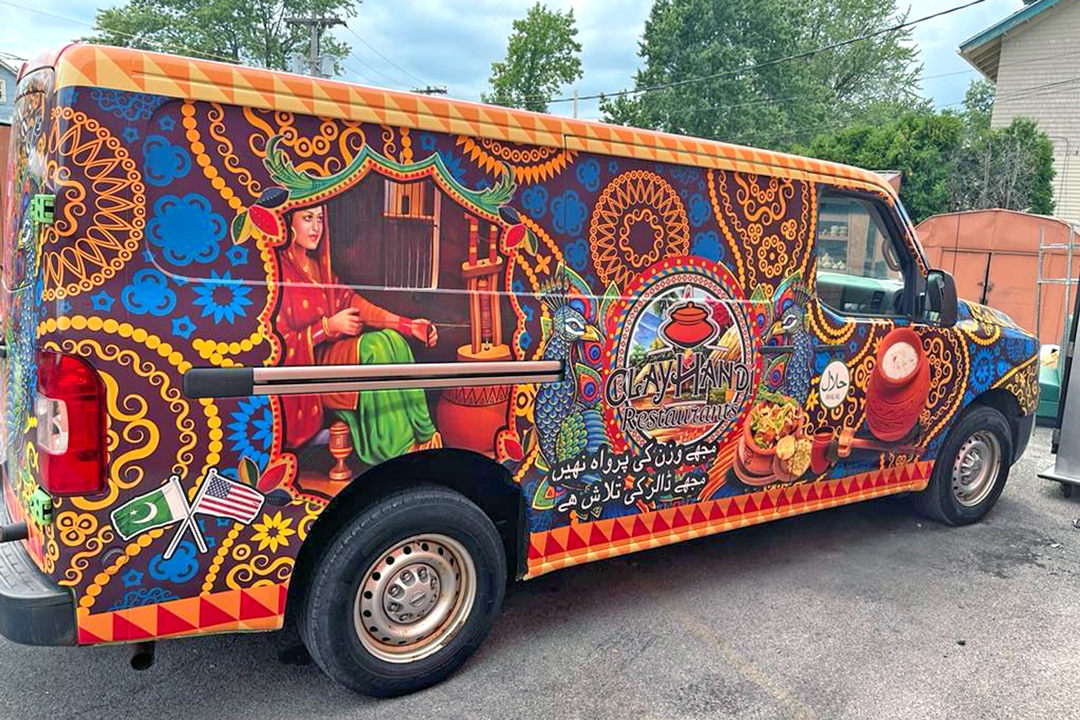
Shah envisioned a “crazy, busy, peacock paisley pattern” inspired by Indian art, with the goal of creating something bold and attention-grabbing. He provided a reference image that captured the level of detail and energy he was drawn to, but it combined illustration, symbols, and pattern in a way that lacked clear hierarchy. This required interpretation, translating that visual density into a pattern-driven design that could feel readable, cohesive, and effective at scale on a trailer.
Process
Refining Direction
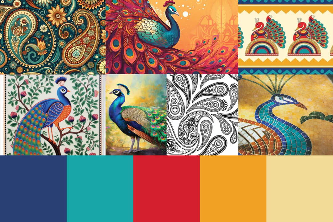
I started by breaking down the client’s reference, identifying what was driving the visual impact and what was adding unnecessary complexity. The key takeaway was the level of detail and color, not the use of illustration and symbols.
I then created a mood board focused on color and pattern, pulling from Indian mosaic tiles, peacock imagery, and paisley forms. This shifted the direction away from narrative illustration and toward a pattern-driven approach, establishing a clear visual system using custom paisley shapes, repetition, and a controlled color palette to create energy without competing elements.
Key Decisions
Controlling Density
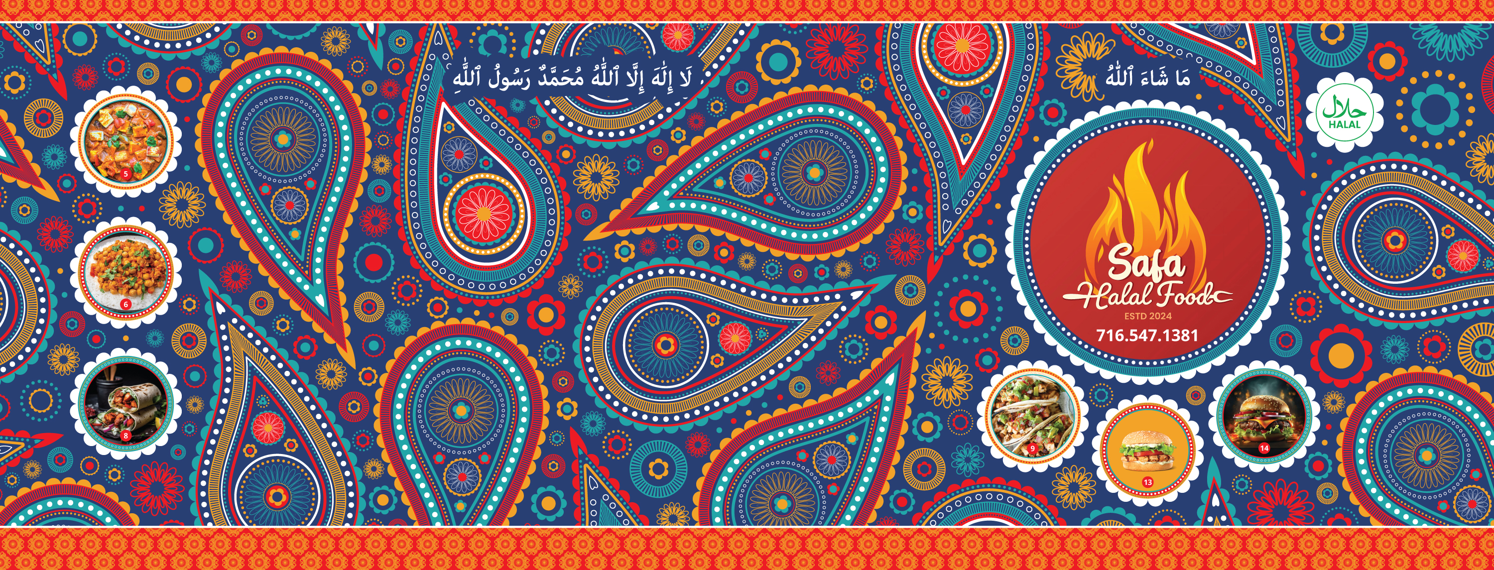
- The reference mixed illustration, symbols, and pattern, so I shifted to custom paisley graphics as a single visual system, creating consistency and reducing visual competition.
- Clear focal points were established using the logo and food imagery, guiding the eye across the trailer and preventing the pattern from overpowering key information.
- Clear focal points were using the logo and food imagery, guiding the eye and preventing the pattern from overpowering key information.
- A bold palette of deep blues, reds, and gold increased contrast and visibility, helping the truck stand out in real-world environments.


Challenges
Make it “Busier”
Shah consistently pushed for more detail, asking for the design to feel even “busier” with each revision. The challenge was increasing complexity without losing control, as additional detail could quickly reduce clarity and make the design harder to read at a distance.
Rather than introducing new types of graphics, I expanded the existing system by tightening the spacing between the larger paisley shapes and filling the gaps with smaller, simpler shapes built from the same paisley details. This made the design feel fuller while maintaining consistency and readability.


Outcome
Organized Chaos
The final result transforms the trailer into a bold, high-impact presence that stands out in busy street environments. The design captures the energy and density the client wanted while maintaining an underlying sense of order.
A pattern-driven composition creates rhythm and movement across the surface, making the trailer visually engaging from a distance. It functions as a strong visual draw, making the truck easy to spot from a distance and helping attract customers.
Client: Safa Halal
Role: Pattern Design | Illustration
Date: May 2024