Nanowear’s SimpleSense is a medical-grade remote patient monitoring wearable distributed through healthcare channels rather than consumer retail. Since it would move through clinical settings and fulfillment before reaching patients at home, the packaging needed to clearly identify the product while establishing trust at first glance.

Vision
Clinical Confidence
Although the device is worn at home, it’s part of a broader clinical care system. The packaging needed to feel medical and dependable, while remaining clear and easy to understand for both healthcare providers and patients. That balance guided the direction, alongside the realities of production and regulatory requirements.
Process
Working Within Constraints
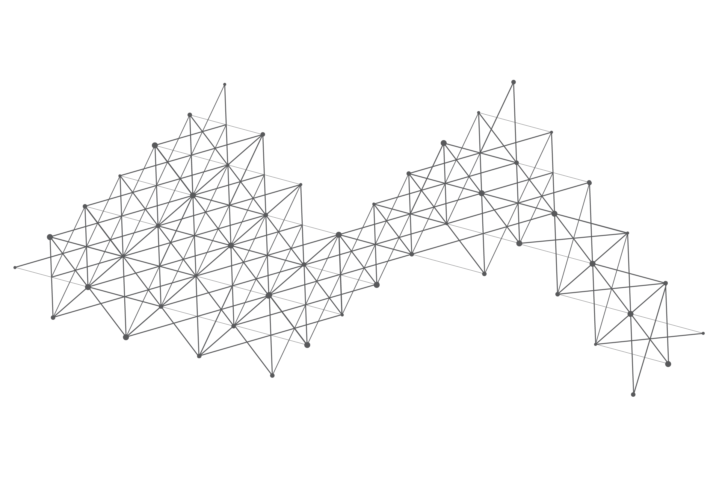
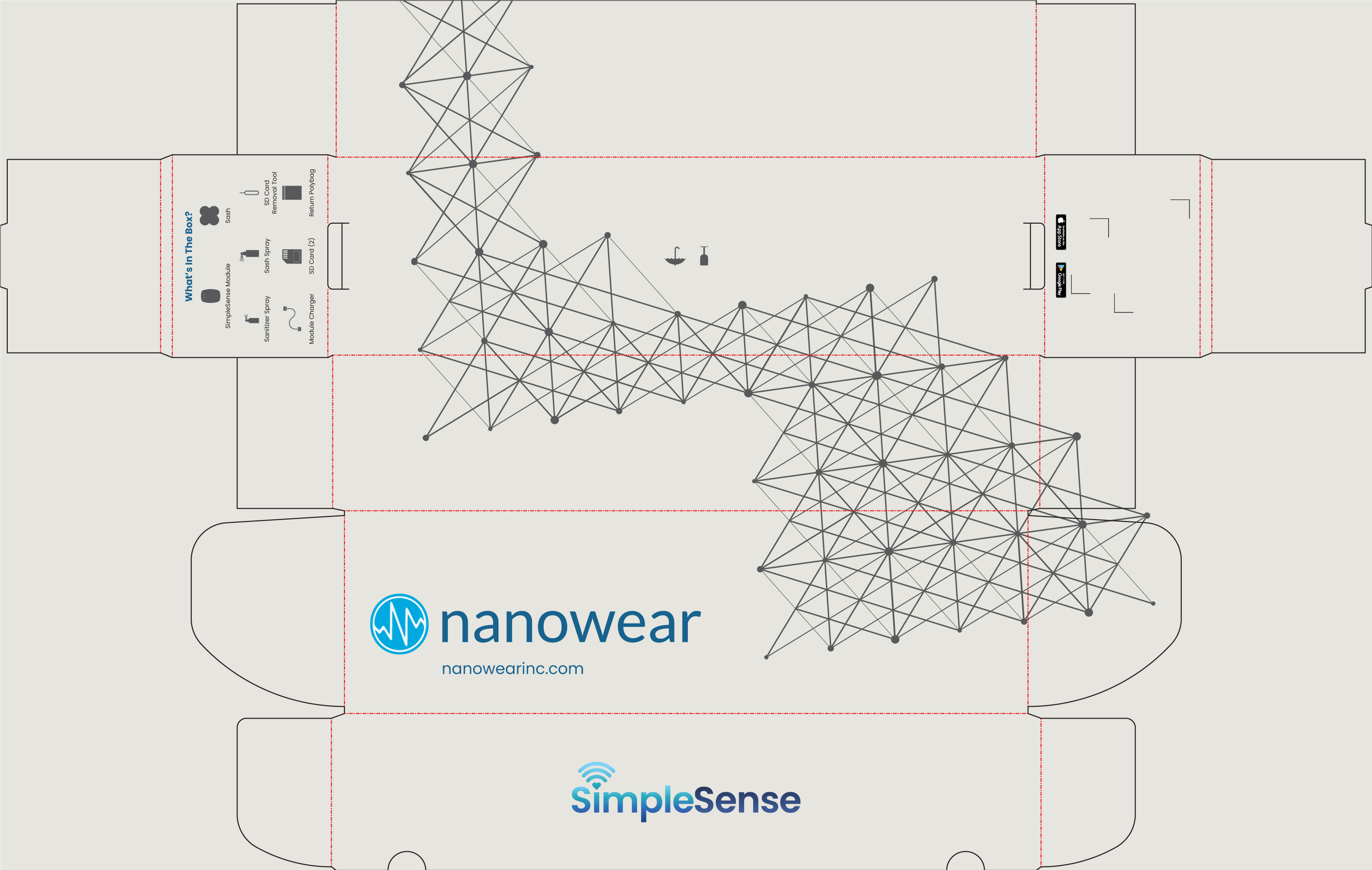
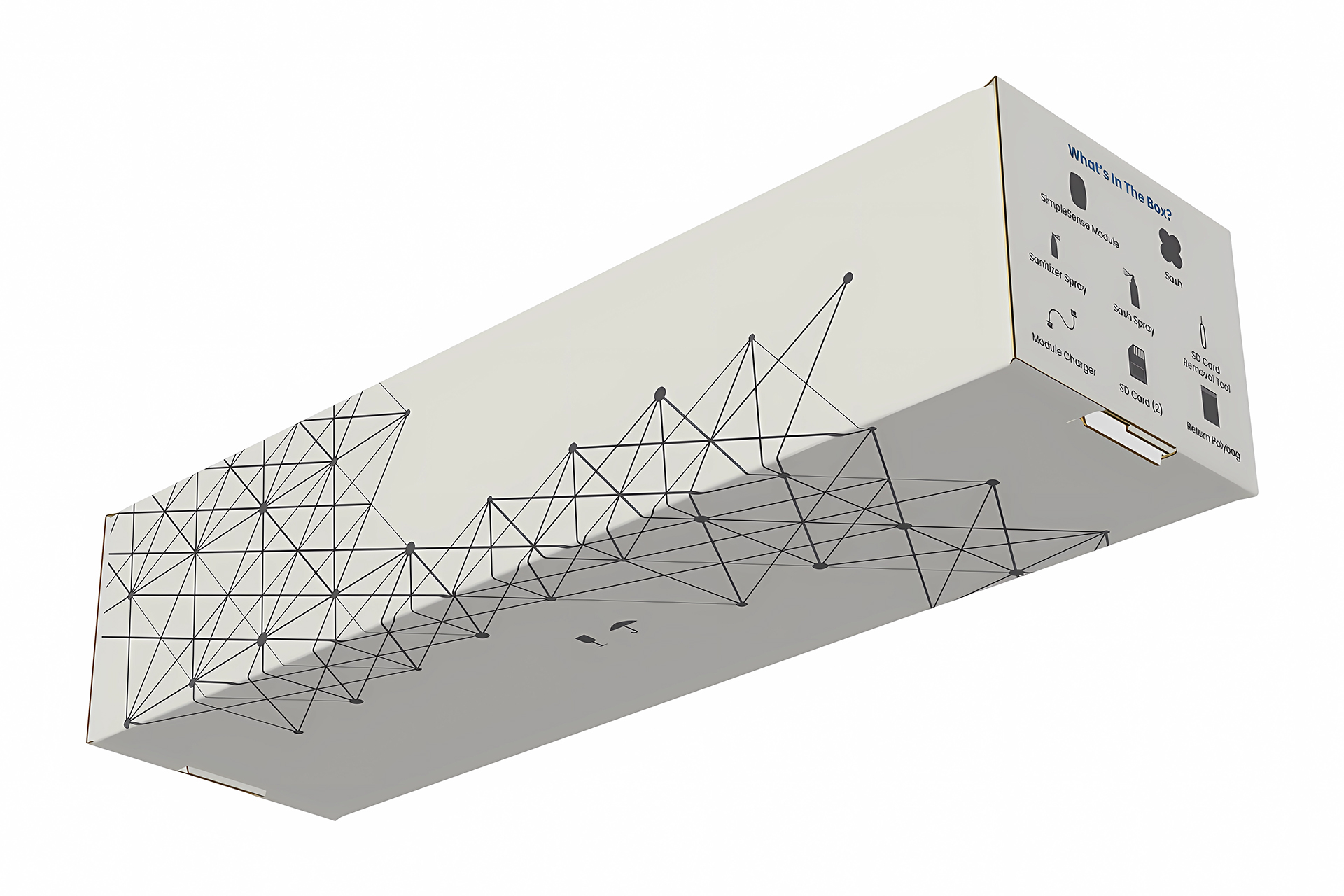
The color palette was already locked into gray, so visual interest needed to come from structure rather than color. Within those constraints, a network-inspired motif was developed, reflecting connectivity and data flow in remote patient monitoring. Contrast and scale allowed the motif to extend across panels while keeping primary product information clear and easy to find.

Key Decisions
Guiding the Design
- The restricted gray palette required visual interest to come from structure, leading to the use of a network motif.
- Information was organized by panel to match how the package is handled, creating a predictable layout.
- “What’s in the box” details were placed on a side panel where users expect to find them, improving usability.
- Limited copy required typography to remain simple and functional, using hierarchy and spacing to guide readability.


Development
Built Across Panels
The box structure dictated how information could be organized, establishing a clear hierarchy across panels. Brand and product logos stayed on the primary panels, while supporting information was distributed across secondary surfaces based on how the package is handled.
Return and contact messaging was reserved for the interior, appearing only after the box was opened. This allowed the exterior to remain focused while still providing necessary information at the appropriate moment.
Typography followed Nanowear’s existing use of Poppins, maintaining consistency with the broader brand.
Challenges
Creative Restraint
Most of the packaging was already defined by production and regulatory specs, which left limited room for visual expression. The challenge was finding a way for design to contribute meaningfully without pushing against clinical expectations. The network motif became that opportunity, adding structure and connection while keeping the package appropriate and compliant.
Outcome
Controlled Reveal
The final packaging presents a clean, clinical face on primary panels, establishing trust at first glance. As the box is handled, the network-based motif becomes more visible across secondary surfaces, reflecting the product’s connected nature.
Clear hierarchy and iconography support efficient handling across clinical distribution and patient use. The result is packaging that is easy to navigate, compliant with requirements, and appropriate for clinical use.
Brand: Nanowear
Role: Packaging Design | Information Design
Date: June 2021